


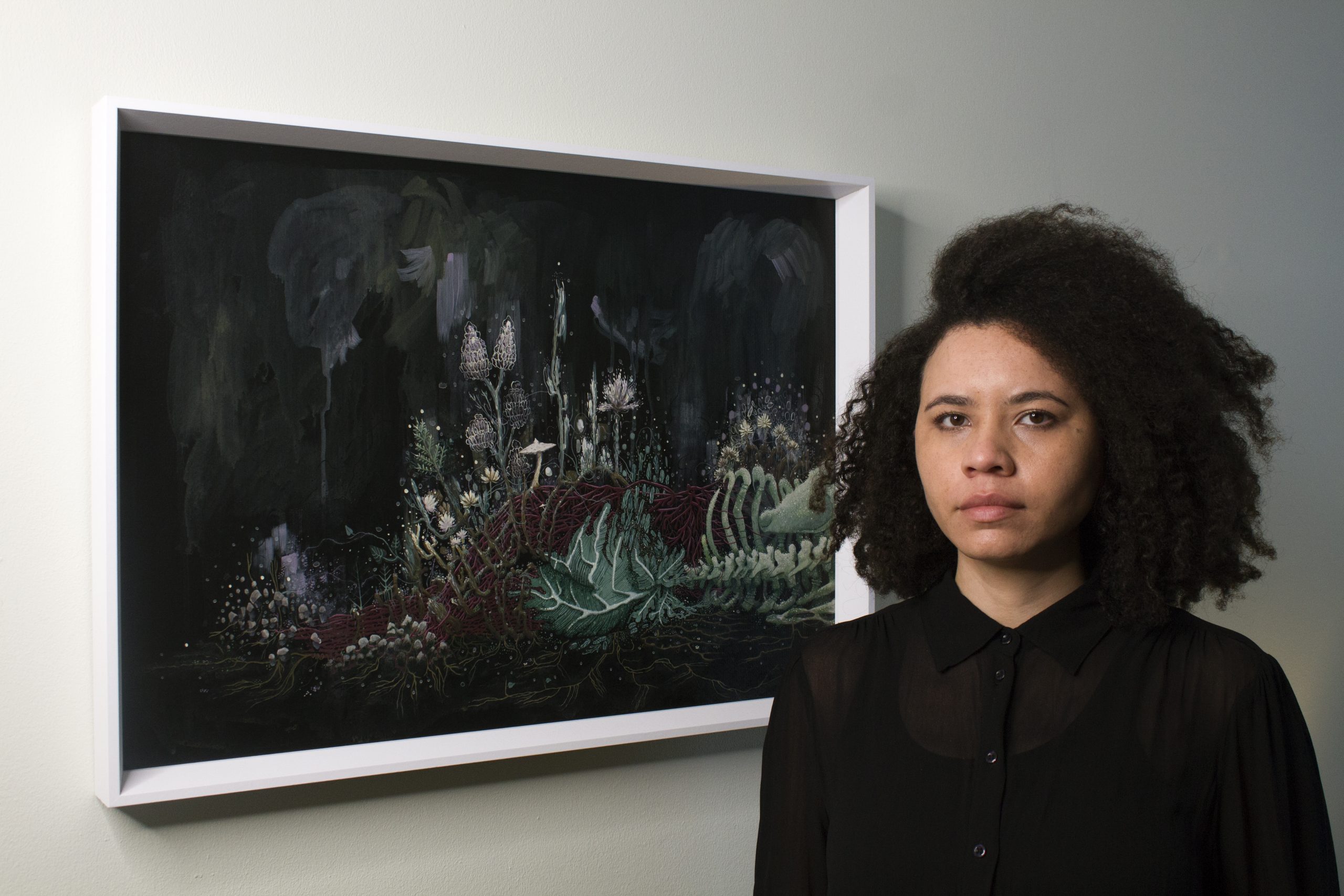
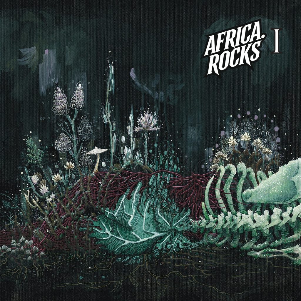
AFRICA.ROCKS’ first physical compilation brings together 15 bands from 15 African countries on a CD that will be distributed free of charge through the Season of Mist online store. Its cover was created by South African artist Caitlin Mkhasibe, who approached the music through recurring ideas of self-actualisation, loss, history, decoloniality and nature. The finished image shows an androgynous body merging with bones, roots, moss, plants and unfamiliar organic forms. Painted by hand on A1 paper, it developed through close listening to the compilation and Mkhasibe’s interest in anatomy, small ecosystems and the relationship between the body and the land. In this interview, she explains how the songs shaped the figure, why the handmade surface was important and what she wanted listeners to encounter before pressing play.
When AFRICA.ROCKS invited you to create the cover for its first sampler CD, what was your first reaction to the project?
I felt a combination of surprise and excitement. I was honoured to have been asked to be part of such a cool project in this way. I generally enjoy creating visual responses to sound, and I’m glad there will be a physical compilation showcasing African bands.
We gave you music from the 15 bands as the main source of inspiration. How did you begin listening to such a varied compilation and searching for an image that could bring it together?
I began listening in the order of the tracklist emailed to me, starting with LohArano’s “Fototra”. I also read the published descriptions of each song that the bands had shared on their websites, Bandcamp profiles or beneath their official music videos on YouTube. I noted the titles, lyrics, album artwork and any recurring themes. I wrote down ideas and moods and began thinking about the imagery they suggested. For fun and as a warm-up, I drew a rough map of all the bands’ countries to see whether this particular group formed an interesting shape that could provide some visual inspiration.
“I wanted to depict the figure as part of nature and growing with it, instead of appearing domineering or extractive”
You identified recurring themes of self-actualisation, loss, history, decoloniality and nature. Which of those ideas first gave you a clear direction for the artwork?
I had a bias towards nature because it is already a recurring subject in my art. I usually work quite abstractly, using suggestive mark-making as a visual language for intersectional ecofeminist ideas. Many of the 15 bands’ single or album covers featured human figures, so I realised that I would need to challenge myself to create an abstracted figure. I kept that thought, and how I might approach it, at the back of my mind throughout the early stages of the process. Land and time, including human history and decoloniality, are intertwined, so it felt possible to anthropomorphise nature. However, I wanted to depict the figure as part of nature and growing with it, instead of appearing domineering or extractive. On this continent, we share a collective anger born from being undermined and exploited, in one way or another, by other governments and the companies lobbying them.
How did the songs shape the figure that appears on the cover?
Horror imagery depicting false prophets or destructive systems of power confirmed my decision to use anatomical imagery for the figure on the cover. The darkness and morbidity of Botswanan old-school death metal band Overthrust’s “Demon Grave” draw on African folklore about ghosts. Since horror is my favourite genre for addressing interpersonal and societal problems, it was fun to work with the imagery evoked by “Demon Grave” and exaggerate it. I imagined a supernatural entity emerging at night from its resting pit beneath the earth, with exposed, dirt-covered bones and pieces of plant matter or roots hanging dramatically from its torso. Even in death, it would take revenge on the self-righteous hypocrites who had harmed society through manipulative and fraudulent leadership. We collectively learn from one another, but each of us is responsible for recognising problematic ideas. Self-actualisation through decolonial introspection is the punk way forward, and this reinforced my decision to place a solitary figure in a transitional process on the front cover.
Songs carrying messages about unlearning include Tunisian hardcore and metal band Znous, which addresses the Arabisation of Indigenous North Africans through political brutality following Tunisia’s Jasmine Revolution. “Emperor” by South African progressive stoner doom band Acid Magus acknowledges the insanity and corruption of power and colonialism. Togolese Asrafo-core band Arka’n Asrafokor commands empowerment through traditional Togolese rhythms and the call to “break that wall”. It also speaks of rising with respect for nature’s inherent wisdom through the line, “Mother Earth knows the core of all living beings”. “Fototra” by Madagascar’s metal, alternative rock, groove, punk and rap band LohArano speaks about Métis heritage through a fusion of sounds that uses Malagasy ternary rhythms to honour nature and the Big Island, Nosy Be. They are influenced by Rage Against the Machine, who are known for addressing injustice, and the single’s artwork shows the three members’ heads intertwined with tree roots. Another influence behind the body’s symbiosis with nature came from Moroccan modern death metal band Sakadoya. Their songs tell a story about transformation, resistance and nature following a collapse caused by greed. Through a primordial force, good-hearted human beings disintegrate and transform into hybrids of humanity and nature, becoming something reformed and stronger that can protect the Earth.
“I wanted the texture of the paper to remain visible as a reminder that the work was handmade at a time when AI is everywhere”
The body appears to be returning to nature, with plants, moss, bones, roots and vein-like forms growing through it. What did you want that image to express?
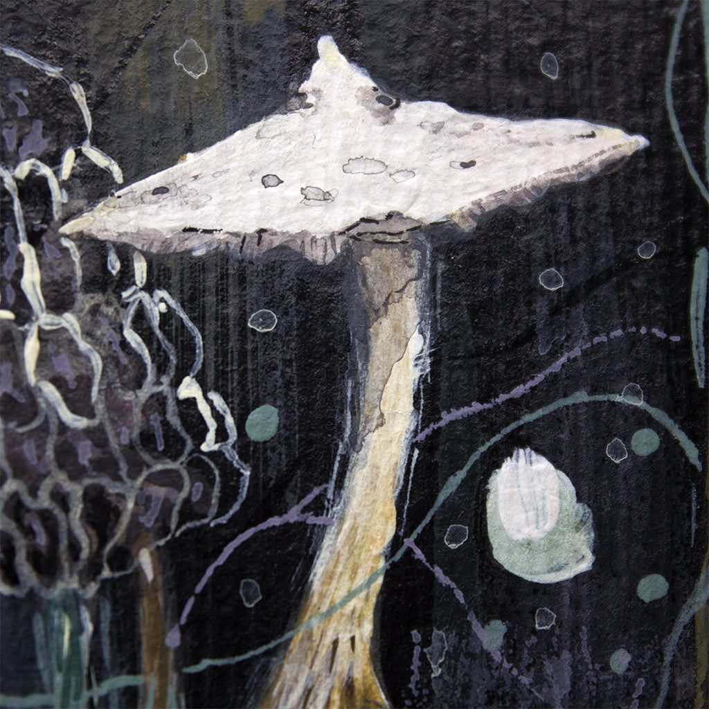
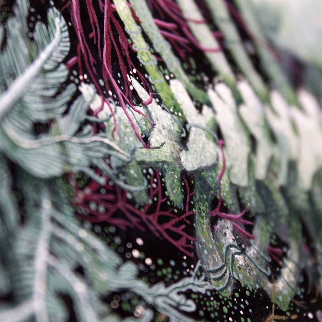
I did not want to create something patriarchal within the tradition of male-dominated Western heavy music artwork. I wanted something vulnerable, with its back facing us and its body lying on its side instead of standing upright and confrontational. Through that sensitivity, it becomes something less destructive. Metaphorical warriors can take unconventional and inclusive forms, and the figure is deliberately androgynous. We view the body as though we are also on the floor, rather than looking down from above, so we are equal to it. The head is absent simply because of the way the original sketch was composed. There is no additional meaning behind that decision. Because the AFRICA.ROCKS logo uses a shade of green, I wanted to echo it in some of the plants and highlights. Overall, the artwork is intended to appear whimsical. The rocks forming the right foot are levitating, mirroring the growth of unfamiliar plants such as deep-sea jellyfish-like flowers and fleshy mushrooms. They symbolise forging your own path away from what is known or accepted by creating your own world or scene. The imagery remains familiar because we recognise nature and the body, things that have always been part of us. The body is integrated into nature and is not separate from it. I also wanted the texture of the paper to remain visible as a reminder that the work was handmade at a time when AI is everywhere. Our relationship with the environment represents progress, and anything new that becomes a catalyst for change must be constructive in its ethics, instead of destructive and extractive like neocolonialism.
“as a biracial person of Zulu and British heritage, [i] only felt a sense of belonging within the margins of South African society”
You returned to an older sketch inspired by James Jean’s “Viscera”. What made you recognise that sketch as the right starting point for this project?
I was given Jean’s Memu, a box containing 100 postcards, for my 21st birthday, and I have kept returning to this particular artwork over the past 12 years. The original piece, measuring approximately 25 by 20 centimetres, was created in 2010 or 2011. It depicts an androgynous person lying on their side in a foetal position, with the body seen from above. The detailed linework is delicate like a Chinese silk scroll painting, while also being graphic like a comic. To me, the work is a labyrinth of anatomy. The skin is formed from lines resembling hair or coral that spiral and wrap around one another to create the human shape. The skin separates in places, allowing the viewer to see through the body between its intermittent spirals.
Inside the figure are birds, Jean’s signature human heads cradled by leaves, or “lettuce heads”, and botanical elements within the limbs and chest. A mermaid is cocooned along the length of one leg, while an octopus extends through the other. The hands and feet remain familiar and completely covered by skin, although the fingers of one hand are slightly elongated. I love the work, and the amount of thought and visual language behind the surreal piece continues to inspire me. My guess is that this solitary figure in a blank space was an early version of his Descendent figure, which appears frequently in his later paintings and sculptures. It shows a boy suspended upside down in space, symbolising his movement between Chinese and American culture as an immigrant. I relate to that feeling as a biracial person of Zulu and British heritage who has only felt a sense of belonging within the margins of South African society. Heavy music in Africa also feels multifaceted. It has been influenced by the legacy of Western heavy music while still not being fully recognised for its role in originating the sound.
You used photographs of deer bones and three-dimensional medical models from Anatomy Tool as references. How did you balance anatomical detail with the more improvised parts of the figure?
The foreshortening of the figure’s bent left leg, and the form as a whole, is proportional to its pose. I kept the spine, ribcage and shoulder blade close to Anatomy Tool’s skeletal model, while the vertebrae became more cartoon-like. The flow of the red veins is aesthetic and not anatomically accurate to the nervous system, although their colour was taken from anatomical references. The linework on the giant leaves beneath the lower back resembles the gluteal muscles, while the bark connecting to the flowers becomes skin.
You often notice the small ecosystems growing from tree stumps and rocks during your walks. Which details from those observations entered the artwork?
The rising stones forming the figure’s feet have moss growing on them. The legs and left arm, which sits behind the ribcage, have the texture, colour and shape of tree-stump bark. They also contain the different forms of moss and lichen, purple, white and yellow microflowers, pale mushrooms, ferns, ivy leaves, vines, grass and clover that grow on those surfaces. The area beneath the body resembles the clusters of small plants that grow under tree stumps because of the shade they provide and the mulch created by fallen leaves from the trees above.
Why did you choose to enlarge the sketch and paint it by hand on A1 paper?
I usually work on a smaller scale, painting on very thick, textured paper and photographing details of the mark-making to exaggerate their relationship between the microscopic and the macroscopic. The nature of this artwork required a great deal of visual information to realise the idea more fully and make the surrealism believable, despite its highly stylised form. I wanted the body to feel immersive and to have a sense of depth. Instead of sitting at a desk, I stood for most of the process and used a makeshift easel. Because the large sheet of paper offered so much surface area, I worked patiently, making sure that every section gave the viewer a reason to pause or echoed another part of the work, helping the finished image feel cohesive.

What materials did you use, and how did ink and paint serve different purposes in the finished work?
I used art materials containing no animal-derived ingredients, including white acrylic paint, primary-colour inks and synthetic brushes of various sizes on Hahnemühle paper. During the preparation process, I mixed paint, ink and water to create coloured pastes, which I stored in sealed, upcycled containers. I then used black ink to tint the colour combinations for the shadows or highlights. I also relied heavily on water to create suggestive washes and the illusion of translucence in certain areas. The final scanning process was difficult because the dried ink had a sheen, even though it was not made with shellac. Neil at Print Art did an amazing job of capturing the piece. I have made a note to mix the ink with paint in future to avoid this problem. I am drawn to the punch and depth that ink gives to the kind of void-like background I enjoy using.
What do you normally listen to while working, and what accompanied you during the making of this particular piece?
I normally listen to new album releases, recorded live shows such as KEXP sessions, older Hellfest performances filmed by Arte, band podcast interviews and paranormal stories. While making this piece, I continued listening to the compilation’s tracklist to remain inspired. I also listened to albums by Swiss old-school black metal band Vígljós and a live interview they gave during their African tour on Capital FM Kenya’s The Fuse 984. Other things I listened to included sunn O))) by Sunn O))), Neurosis’ An Undying Love for a Burning World and interviews with the band. At one point, I also had the Swans documentary Where Does a Body End? playing in the background.
The sampler will introduce 15 African rock and metal bands to listeners in Europe. What did you want your artwork to communicate before anyone even pressed play?
The first song I heard from the 15 bands was “Fototra” by LohArano, and it has such driving energy and force. I feel that they have created their own sonic path with a special kind of intensity, so I wanted to make something lively that honoured the power and propulsion unique to African heavy music. I hope the surreal quality of the cover creates enough curiosity to make people want to hear the compilation while retaining something familiar from metal’s darker aesthetic. I want the artwork to feel inviting to everyone who already loves African heavy music or wants to learn more about our growing scenes.
Follow Caitlin Mkhasibe on Instagram: @caitlinmkhasibe
Listen to the full AFRICA.ROCKS compilation on Spotify:


